Sunday 17 February 2013

An end to the infection

This weeks homework was to study the video tutorial by an artist known as daarken and then create our own character using the same techniques used by home.
(Link to video http://enliighten.com/blog/enliighten-debut-speedy-paint/)

I decided to paint a zombie, this painting evolved by itself since I didn't really have an idea in mind of what it was going to look like.
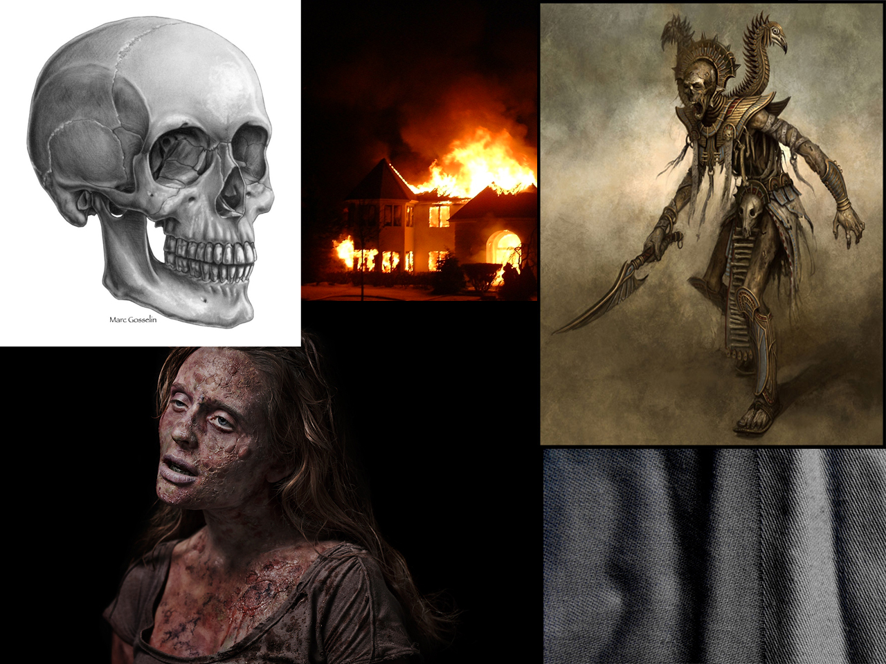
Reference material.


Like in the video tutorial I started by creating a smokey background so that when I started to paint my zombie I wouldn't have to paint the entire body.
I used several of the brushes provided in the homework.


I started my character by just painting with a chalky brush directly over the background to get an idea of what I would be working with.
I also dropped a levels layer on the background and reduced the darkness so I could see what I was painting.


Now that I had a base to work from I refined my shapes into distinguishable body parts, I paid close attention to the face since I knew this would be my focal point.


Now that I had my values I continued to improve on them while adding detail to the body.
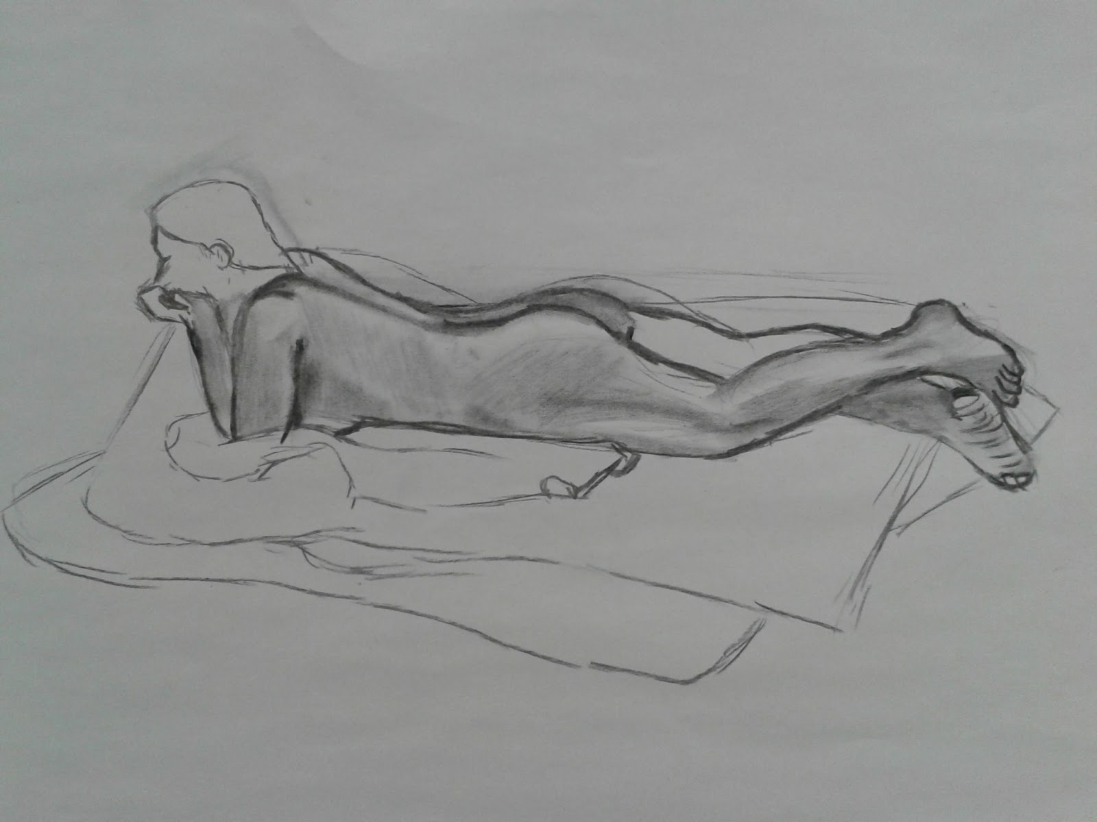
To paint the right arm I posed in front of a mirror to figure out how it would look.
The hair was painted on a single layer that I worked on over the entire course of the painting.


I knew that I wanted my zombies face to be torn at the mouth so I needed to know how the skull would look, by adding the skull reference I reduced the opacity and painted the parts of the mouth and teeth I wanted visible.


Once I had a simple mouth painted I went over it in detail and added the rest of the face using the reference of the zombie woman.


Now that I had my values and basic details I painted in detail all over the body, adjusting the nose so it was just a hole, making the clothing wrinkles by using the texture in my reference images and generally adding detail and highlights where needed.


To finish off the background I used the colour picker to get the colours from the fire reference and added a photo filter with an orange colour over the entire image to bring it all together.

I added an outline glow to the closest side of the zombie to the fire to make it look more believable by just painting the brightest yellow from the background over the body.

I painted in the flecks of flame with the same chalky brush I used to paint my values and placed them on an overlay layer so they looked to be glowing.

For the colours I painted them over on separate overlay layers for the different parts and adjusted the opacity until I was pleased with them. I kept the colours very saturated because zombies aren't known for their colurfulness. 

A zombie tends to eat brains so I added blood stains over the mouth, clothes and hands.


I could have spent many more hours on this painting and improving but I felt that I was at a point that I could leave it and be happy with it. I in fact had to erase a lot of detail that I made since when I flicked the layer on and off I could see that the simpler it was the better it looked.

As mentioned in the homework brief I constantly flipped the image horizontally to be sure that my character wasn't going wonky and I believe this to have worked.

I was told in a few of my previous paintings/drawings that I need to focus on composition so I made sure to resize and move my character to the center of the page with equal space from the top, left, right and bottom.

The hardest part of this painting was the transition from values to detailing. It took my a long time to paint in things like the mouth and the collarbone and make it look believable.


Saturday 16 February 2013

Portrait

One of my sketchbook works for the week.
I made this using pencils 5H, 3H, H, HB, B and a fine pen for detail.

Reference http://liranlevi0.deviantart.com/art/Portrait-78097403

I am pleased with the finished sketch but the picture below is very dull compared to the paper version which has made the sketch lose some of its depth.
What I should focus on next is darkening shades even more to add extra depth and use my fine line pen for more detailed work.


Thursday 14 February 2013

Life Drawing 5

Life drawing sketches charcoal/ink.

These sketches were 5 minutes each and are of other students that were moddeling for us, we started by sketching a pose without the model and then getting the model into the same pose and sketching them to see how close we could get the first sketch to the second.


Five minute warmup sketches of a nude life model.


15 minute ink with brush, I found this very difficult to use since ink does not have any midtones and I found painting with a brush it was very difficult to get the lines I wanted. Instead I should try to paint with just values but again with ink this is difficult as it does not have much range.


Second 15 minute attempt with ink, i managed this slightly better than the first but I am still not pleased with it since I could not refine any of it since once ink is on paper you cannot remove it.


30 minute charcoal sketch. The pose was not very interesting from where I was standing but I feel that I managed to get the perspective right on this sketch. I am still trying to speed up my workflow so that I have more time to do some shading, you can see that I began but did not have time to finish.


Another 30 minute sketch, I rushed this piece to try and get on to shading as quickly as possible however this led to the perspective being off in the drawing which ultimately made the sketch look a lot worse than I could have been.
I am pleased with the torso since I spent most of my time on this area however it is too wide to what the model was but did not stop to correct due to my rushing.


Tuesday 12 February 2013

Blending Technique

A small task set to us to practice blending techniques.
Using a chalk like brush we set the control to pen pressure so that the harder I pressed on the tablet the darker the brush stroke, then using the eyedropper tool I constantly changed the shade that I was painting with to smooth out the face.
Original
Finished

I very much liked this technique and the brush, I could have gone over and smoothed out the chalkiness of the brush but decided that I liked the rough look and left it as it was.


3D Paintover Robot

This homework assignment was to produce a 3D paintover of a robot character.
Since I was still playing catch up from being ill last week I didn't have much time to draw some designs so I used two silhouettes that I had painted previously.

I had already decided in my head that I would be using the design on the left.

My robot character is named Marvin. Marvin is a worker robot very common in a warehouse since they are used for heavy lifting and completing complex tasks such as building products at the warehouse.
Marvin stands about 6 feet tall and is programmed to never leave the warehouse, if there is no work to do he is programmed with a 'look for something to do' code. Not that this helps him much because the setting is post apocalyptic. 
Marvin has been abandoned in his warehouse completely alone so he wanders the warehouse occasionally doing repairs to the building when needed, he is a very worn down robot that is often falling apart himself.
Over time Marvin begins to get curious about what is on the outside, this is a result of the 'look for something to do' code but the code restricting him from leaving leaves him conflicted in what to do actually do.

From my design silhouette I had a very clear picture of how to build Marvin in 3Ds Max.
I began creating Marvin from head down, focusing on detail all the way through.


To create Marvin's broken arm I just created a cylinder with 1 cap segment so I had several vertices to play with, by using the move tool I just dragged some of the vertices around to make it look snapped.


I was not very happy with the arms and had planned to go back and change them since they didn't match the design very well, instead I decided to save time and change them in the paintover.


As I was nearing the end I began to put Marvin into a pose so I could see how the end result would look and I was happy with this.
To create the broken panel on his leg I simply detatched a polygon and rotated it outwards and then created a new polygon in place so I had a surface to paintover later.

For my lighting I used the standard Omni tool and placed several around. I wanted one on his eye since his own glows there needed to be a light source there, one inside his broken arm since it had just broken and was sparking and another just above to illuminate the rest of him.


Final render of my Robot. I decided not to have any kind of background so I could place one in Photoshop.


Once my model was in photoshop I started by placing textures on to it. I used the same textures as I did for the gun turret as it seemed appropriate for a run down robot. To place these I used the distort and warp transform tools with an overlay layer so I would not lose my lighting.


Using some simple textures I placed them onto the background with a cast shadow made by selecting Marvin and on a new layer filling it in black. I then seperated the legs from the floor so it looked like the shadow was hitting the wall behind.


Now I had my base set up I started by painting some simple details, highlights and shadows using the paintbrush tool.
Here you can see that I added some extra detail to the forearms that I said I would previously.


I continued adding detail with the paintbrush using different type of brushes to paint in the rest, I tried to make it realistic by having the rust look like it was by water damage from the streaking lines in places.
I designed the nametag and barcode using the custom shapes tool along with the text and then using the warp transform tool to make them look like they are on the body. I also used a rough eraser brush to make the stickers look torn and worn.


Finnaly I added light reflection from the eye to add realism and I added the sparks from the broken arm along with a glow from it that fades out the shadow in the background.


 I am very pleased with my end result although I feel that I am relying on textures too much with this technique. This is something I will work on in the future and I will try to create my own textures rather than pulling them from the web.
This is where I need to try and improve my workflow since I seem to take a very long time to create most of my paintings and drawings.


Thursday 7 February 2013

3D Paint Over Gun Turret

This assignment was given to the class, the goal being to create a realistic concept of a gun turret using the 3D paint over method.

I started by doing some simple pencil thumbnail sketches to get a design I liked. I found this very difficult as I have not had much experience drawing mechanical objects. I did a web search of gun turrets to get some inspiration.


I chose the bottom left design because I felt it was the most detailed and I had a clear idea in my head of what the story of the turret would be.


Next I started to model my turret in 3DS Max using just the thumbnail as my reference. I chose 3DS Max because I am more familiar with it than Maya and felt I could make a model much quicker.

I decided that I did not need anything more detailed than the thumbnail because I felt that the thumbnail was enough, however if I was to pass the design on to someone else I would have done a quick design in Photoshop with more detail.

Starting with the barrel I used separate cylinders and changed them all to editable polys so I could manipulate them into the shapes I wanted.


Using the boolean objects I was able to cut holes in my model.


To create make my model more interesting any cube shaped object I chamfered the edges to give them a smoothed out and shaped look.


Originally I was going to cut out the polygons on the cockpit so when I moved to Photoshop I could paint windows on it and have it see through however this caused me some difficulty in the renders since some of the normals on the cockpit were not visible.


I did a simple red and grey bitmap material on my model to get an idea of what my colour scheme would be.


I did not need to change much from the original design concept and the model came together relatively quickly.
The tricky part was the lighting, I had not done a realistic lighting in 3DS Max before so I had to search on ways to do this. I found using the Daylight lighting to be my best course of action.
I had to experiment around with this tool to find what I thought was the best kind of lighting I could acheive.
Highlighted in red is at what time I set the sun to be at which was 12pm, I fiddled with the daylight parameters and found Standard Sunlight and Skylight to be my best course of action along with shadows to be on ray traced shadows. 


Coloured and uncolored renders of my model. I had difficulty rendering my models at a size that would fit the A3 size on Photoshop due to my computer not being powerful enough to render an image that large so I settled with the coloured render at 2000x2000


I could now start my paint over in Photoshop. I already knew in my head that I wanted the turret to look as if it had been unused for a long time so I found rusted and broken textures to use.
I had planned to make my own textures however with falling ill I was running late and had to improvise.


To apply these textures I used the warp tool as shown in the provided tutorial video at 2:28 to wrap the scratched metal texture around the barrel and other areas.
I already knew how to use most of the transform tools and found Distort to work the best at fitting the rest of the textures, especially the paneled textures over flat surfaces.
The layer mode I used was overlay, I tried to use screen as demonstrated in the video but it seemed to become too light and ruin the lighting on my model.


I added some small details to the turret such as the smiley face using the custom shape tool and the distort to place it on the side of the turret. By reducing the opacity I could make the face appear faded .
The wires and ladder I simply painted on with the paintbrush tool. I didn't add much detail to the turret because I had designed it to be extremely big and felt that the textures were working well enough on their own to give it a realistic look.


Finnaly I added some extra shadows and highlights using a combination of the paint brush tool, dodge and burn and levels to make the image pop from the background.
I placed a black and white gradient over the image and erased it from the top half to stop the turret floating so much as well as painting in some extra shadows at the base.


The story behind the turret is it was designed to be an anti mechanoid sniper. A futuristic weapon designed to  destroy giant robots and similar turrets with one shot from a distance. However due to their long reload time and having to re calibrate each shot due to the enormous kickback produced from firing the turrets were quickly put out of production. They became a popular collectors piece that many people customized.
This one in particular is sporting a custom paintjob but has been left out in the open for a long time to decay and break.

I am pleased with how the end result turned out however I wish I had designed the turret to be smaller since I feel I could have done much more detail and much more actual painting on a smaller scaled turret. 
Because I was ill I felt very rushed to finish this piece and felt that I did the best I could especially on my very first ever paint over job.


Human body studies

(Sorry for the late upload I have been ill the past few days)

A few pages from my sketchbook showing a study of human anatomy focusing on legs, feet and torso male/female.


I am finding that the oval structures work very well for mapping out a basic form however I need to make a study on how muscles are joined together to create more realistic sketches.